UI/UX
Design
The product interface often serves as a user's first direct interaction with a brand, making it essential for the UI elements to not only facilitate a seamless and enjoyable experience but also to reflect the brand’s core values and foster a genuine emotional connection with users. By thoughtfully designing each element, we can ensure that the interface feels intuitive, engaging, and in harmony with the brand’s identity. Below, you’ll find several case studies and an in-depth look at the design process, showcasing how these principles are applied to create interfaces that resonate with users and elevate the brand experience.
Why I Made This
My company restructured and my role was impacted, therefore I found myself at the mercy of the Service Canada website looking for information on Employment Insurance. I had used this service about 12 years ago, and sadly nothing has changed. It’s still an archaic looking website overburdened by loads of redundant information that scrolls on forever and you still can’t find what your looking for.
Out of curiosity, I tried to see if they had a mobile app for reporting insurance because they had 80 other apps created by third parties on their website, but none of them were for employment insurance. So I called Service Canada to verify this and the other representative on the other end of the phone thought it would be a great idea.
Problem
- Currently there is no mobile application for Employment Insurance reporting via Service Canada.
- Users can report via the existing website, but it’s information heavy, inconvenient, and out-dated.
- Un-necessary calls to representatives or visits to a branch in person are indirect results of this.
- Additionally, incomplete forms may result in a delay or loss of benefits if a user can’t complete it.
Desired Outcome
- An iOS mobile EI Reporting app would allow users to report their status while they are networking on the go!
- Easy to learn & use, efficient, non-redundant, functionally consistent and supportive.
- Be consistent with existing ecosystem/branding but not as over-whelming.
Personas
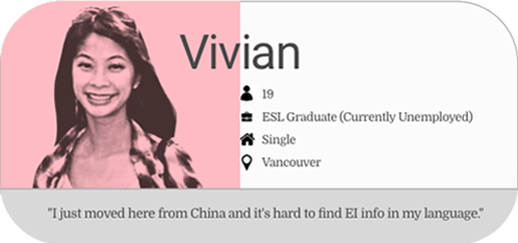
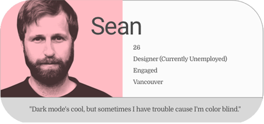

For the purpose of this project, the user flow focuses on Germinal’s desire to network on the go.
He doesn’t want to log onto the main Service Canada site, then go through the various steps to access Employment Insurance so that he can report while he’s meeting potential leads at a cafe.
Moodboard
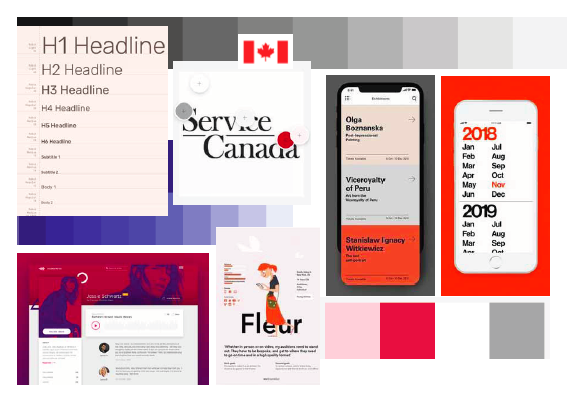
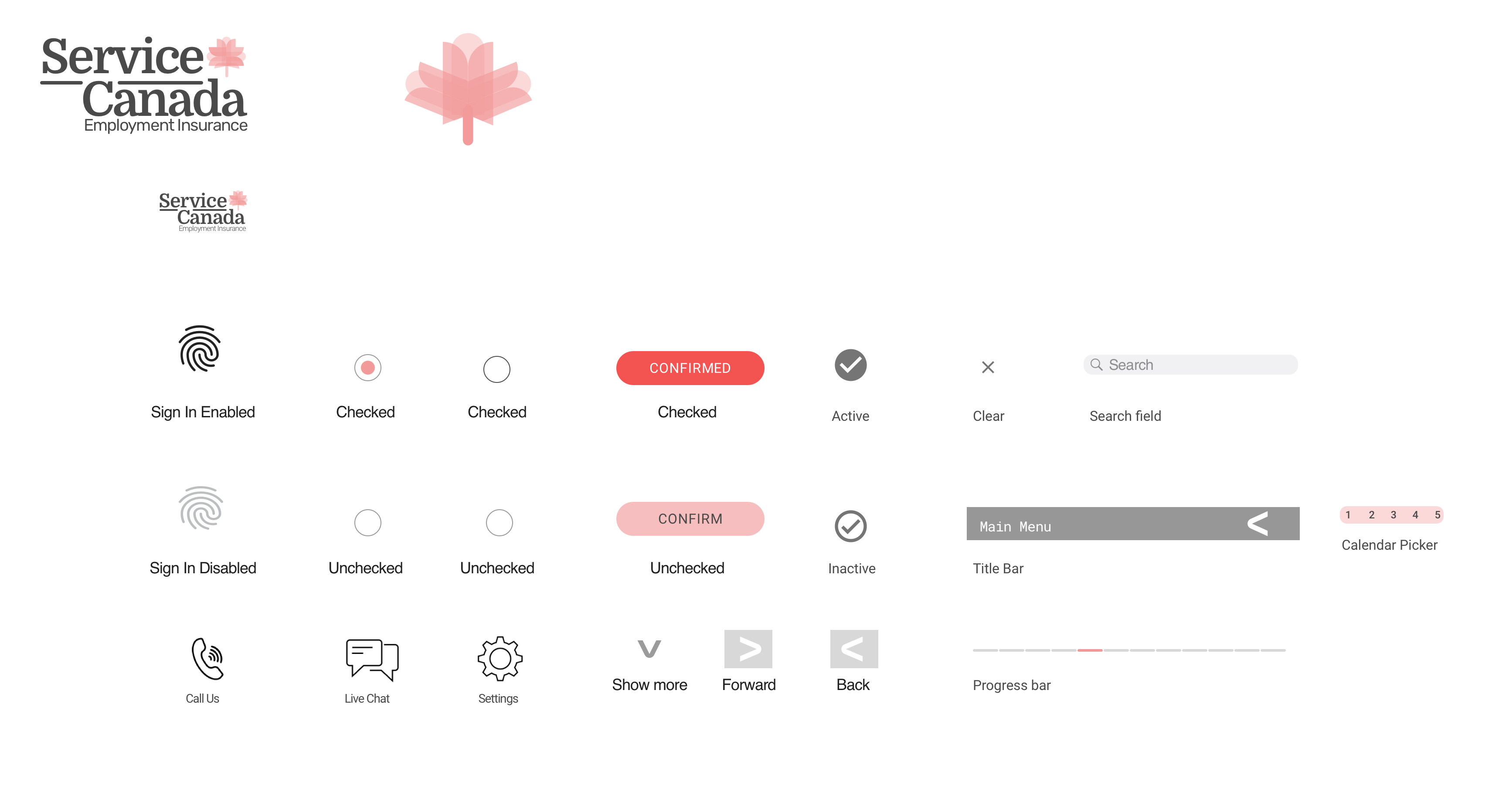
Keeping with the current government branding for Service Canada, I deduced a palette from the black red and whites, but toned them down to softer, more humanistic and friendly tones.
Competitor Analysis
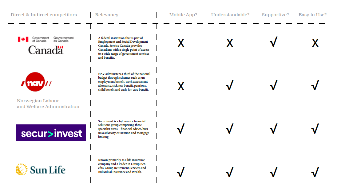
All of the competitors above are different forms of money lenders, much in the same way that Employment Insurance is just helping you out until you get back on your feet.
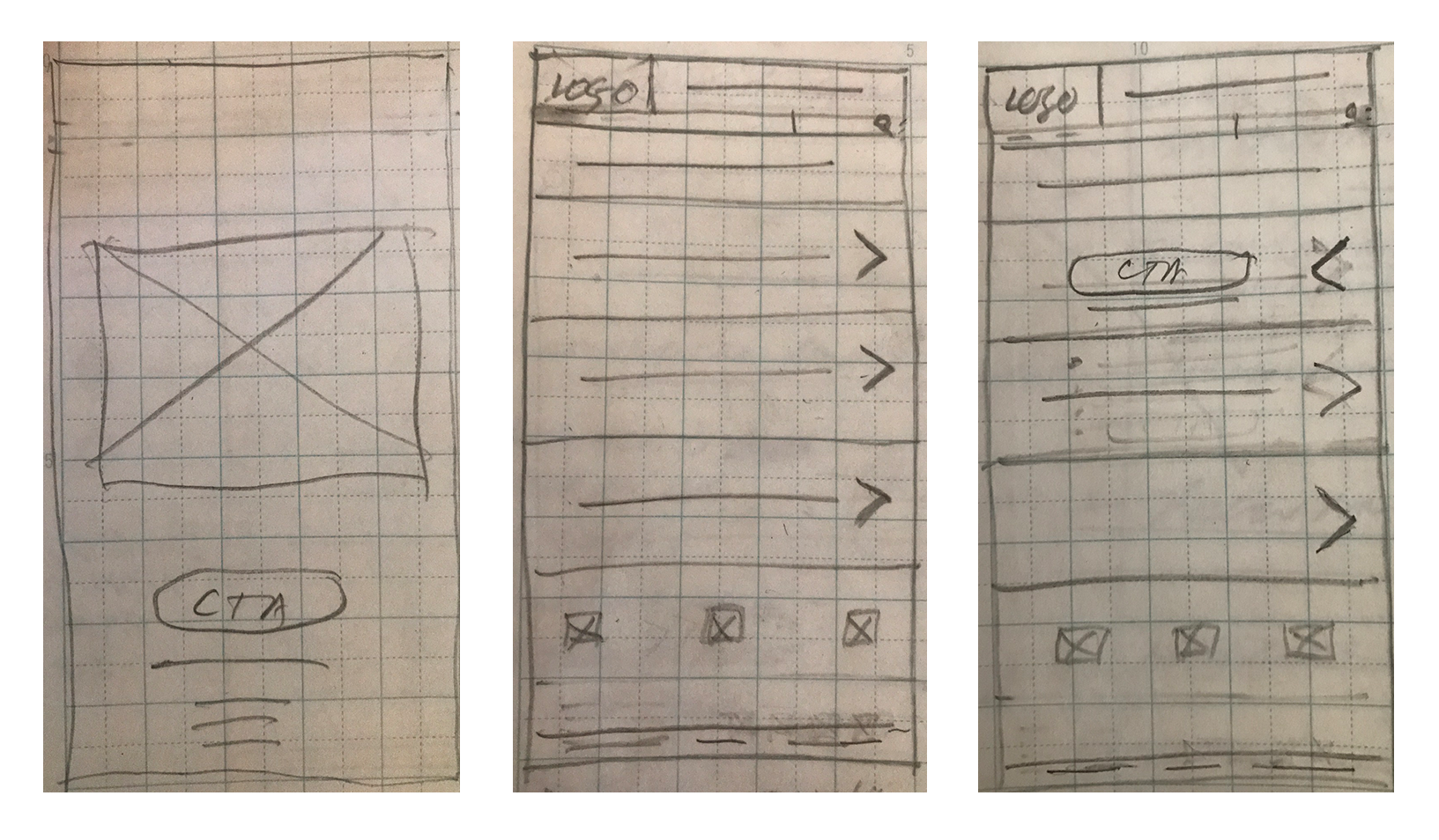
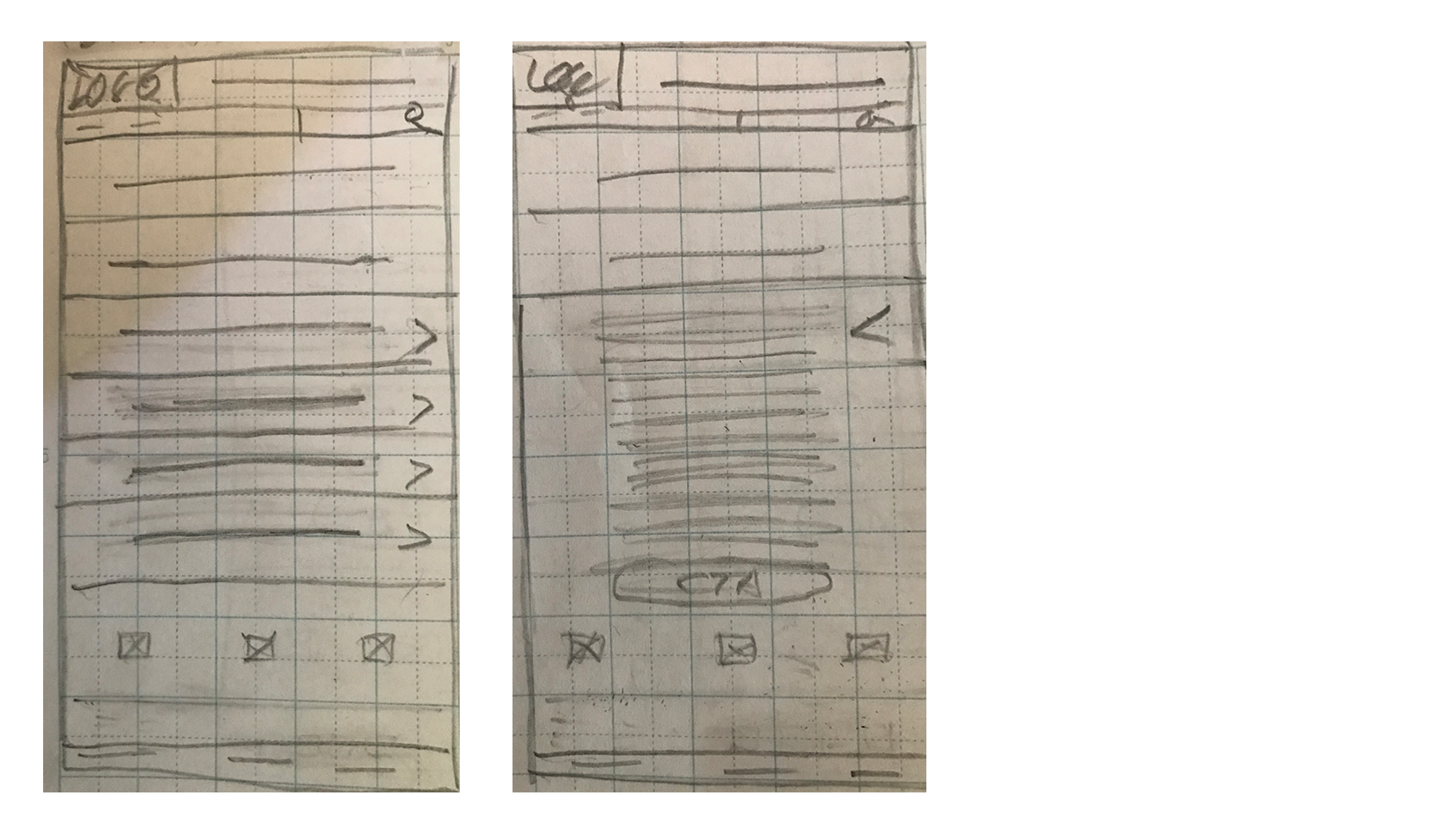
Wireframes

![]()
![]()
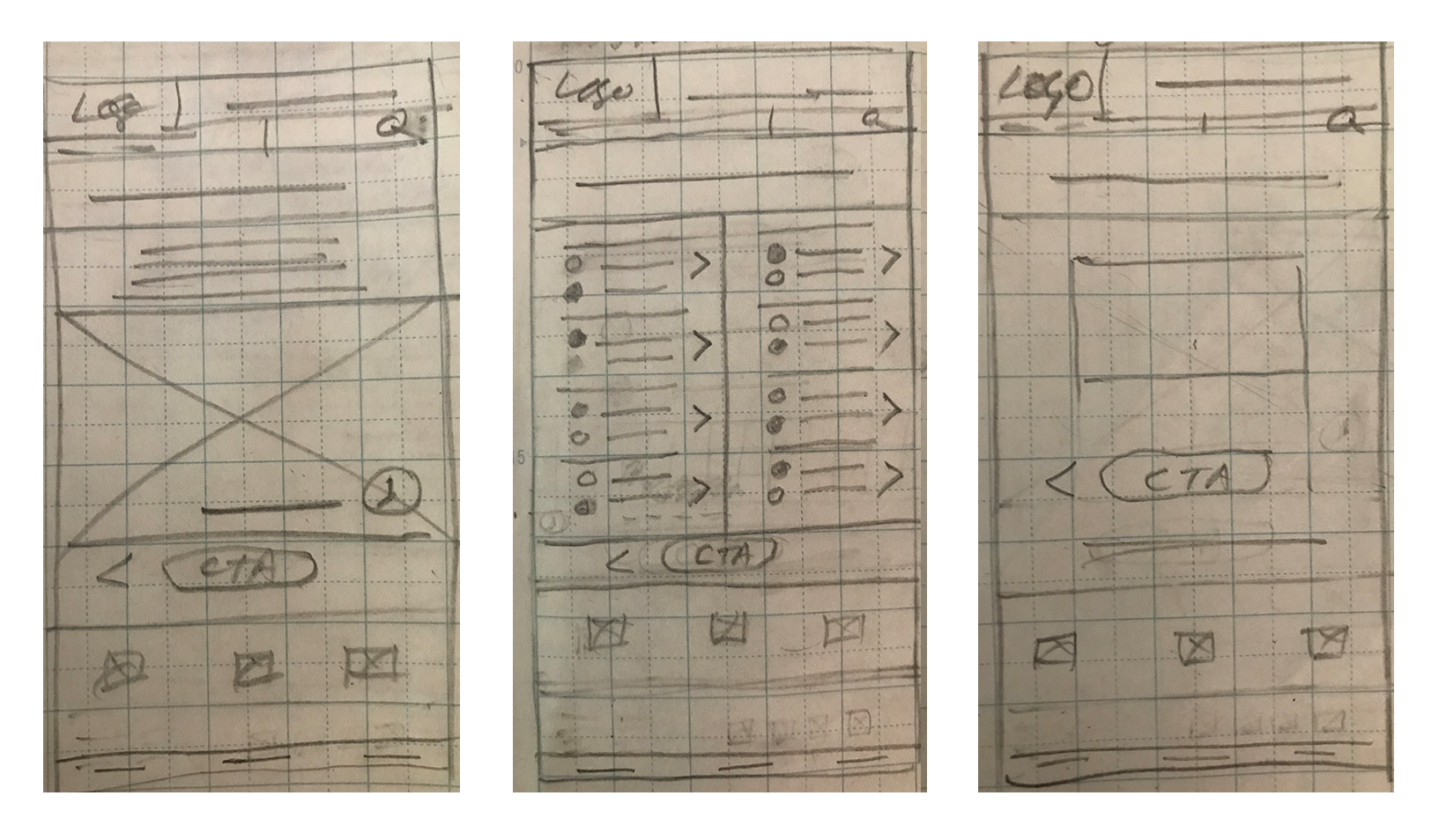
Lo-Fidelity
![]()
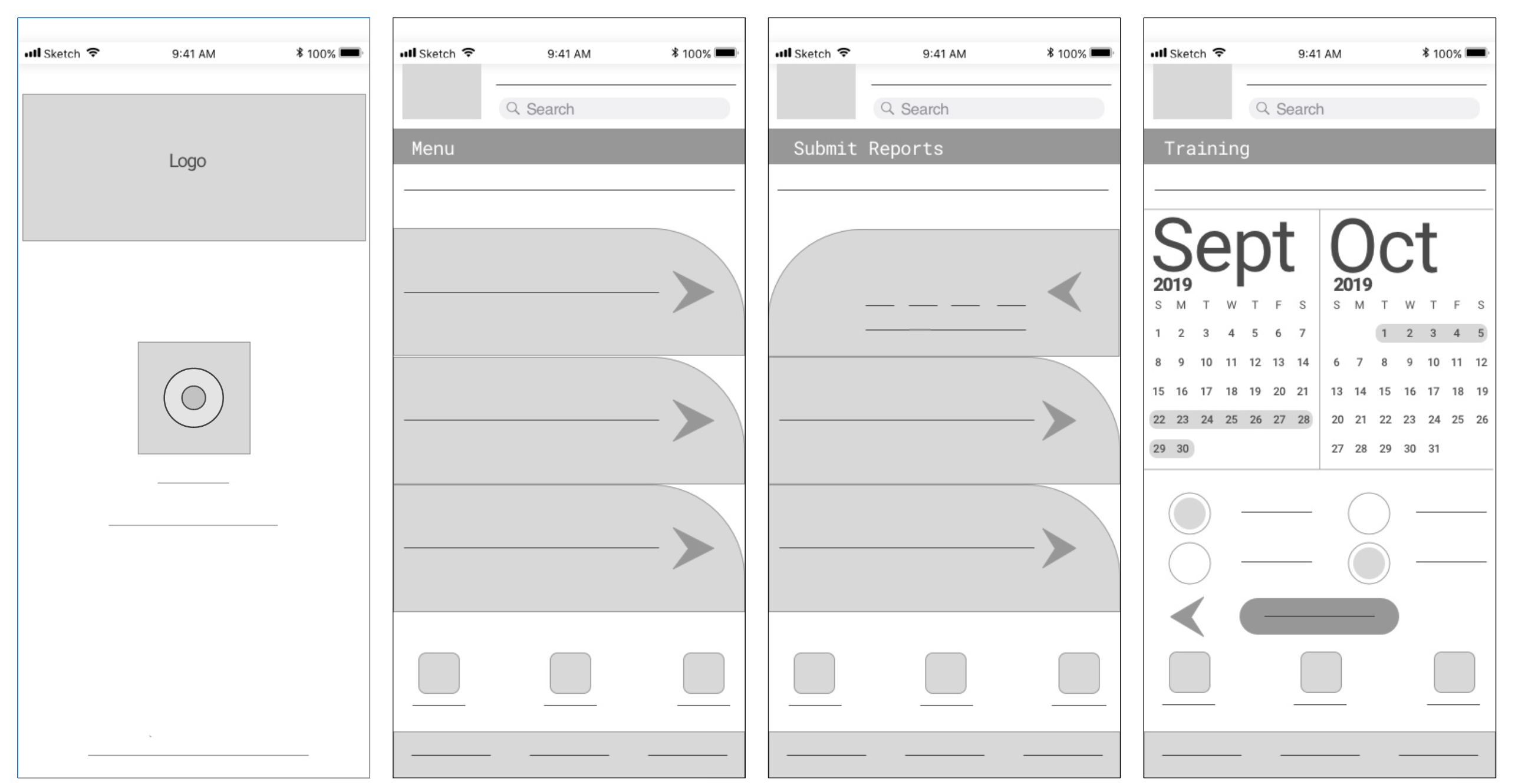


Testing again...this time using Marvel before applying the full UI. I had Germinal test it again, but I also solicited fresh feedback for this particular user flow from 6 other people from a variety of cultural backgrounds. Afterwards, I made any necessary revisions and fleshed out the final prototype.
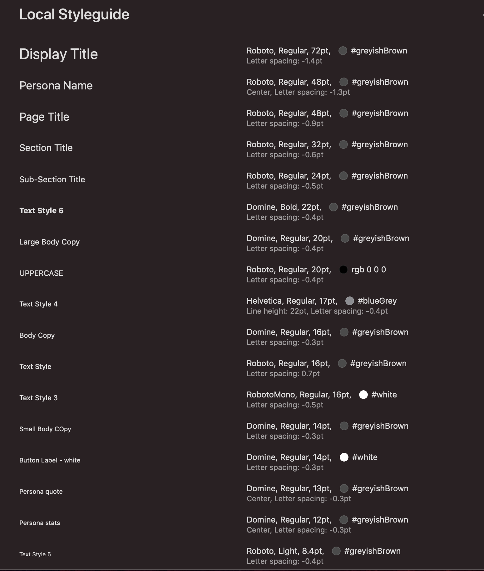
Typography